Je Ka Jeun.
A London food brand whose name is an invitation to come and eat, given a flavour-first website where the imagery leads and the menu is never more than a tap away.
The name means
come, let’s eat
Je Ka Jeun is an invitation in Yoruba, and the website needed to feel like one. Food brands live and die by appetite, and appetite is visual: nobody has ever been persuaded to eat by a paragraph.
The brief was simple to say and easy to get wrong. Let the food lead, keep the words short and warm, and make sure the visitor is never more than a tap from the menu.
The food leads,
the design follows
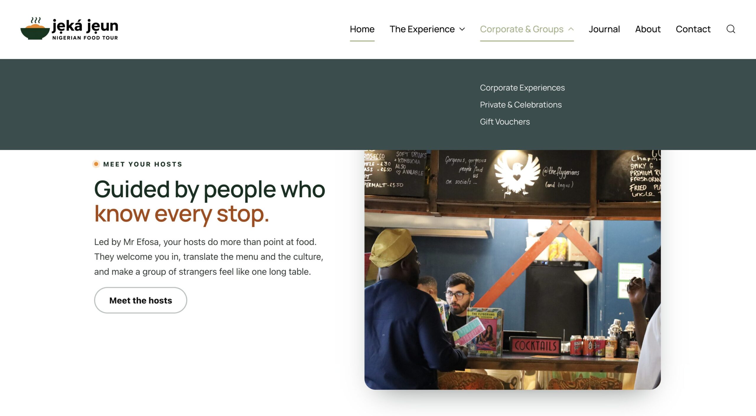
We built the site around bold, appetite-led imagery, with the design deliberately staying out of the way of the food. The essentials, the menu, the location, and how to order, are always within reach, and the tone of voice keeps the brand’s warmth in every line.
On a phone, where hungry visitors actually arrive, everything is one thumb away: see the food, find the menu, and act on the invitation.
An invitation
people accept
The website now does what the name does: it invites. Visitors see the food first, find what they need in seconds, and arrive hungry, which is the only kind of visitor a food brand needs.
Does your website
make people hungry?
If your food photographs better than your website presents it, you are leaving appetite on the table. Show us the brand and we will show you the site it deserves.
No commitment · Responds within 24 hours · London GMT · Global projects welcome